When you’re looking at a few publications, what draws you in? It may be the subject matter, but given the subject matter is the same, where do you look? I’ll tell you – you look at something that is well-designed. You are likely not even aware of it, but that’s what grabs your attention.

Here’s an example. This is ZoonooZ, the official newsletter of Popcorn Park Animal Refuge. I’ve been its editor and designer for many years, and while I’ve always been evolving its appearance over time, recently I’ve been been able to make some exciting updates. What’s the difference?
Expanded use of color combined with use of the bleed makes for a much more attractive look. There was a time when using a bleed (extending color or graphics right out to the very edge of the page), upped the printing costs considerably, but with most printers nowadays the cost is the same or the difference, nominal. Result? More design freedom and a look that draws you in.

Here’s what the newsletter looked like 10 years ago. Working with a non-profit can mean keeping a close eye on expenses. Even 10 years ago, 4/color printing cost sufficiently more than 2/color that we stayed within an economical look in black and brown. With the wider availability of digital printing, prices for the two became comparable, and we brought the ZoonooZ into full color.
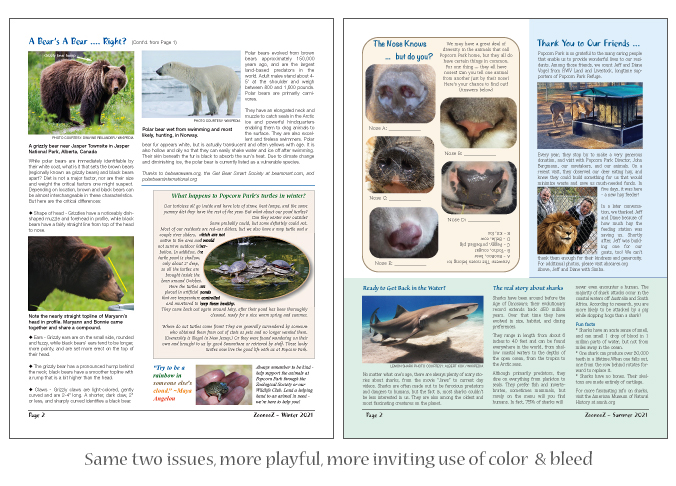
Here’s page 2 of the same two issues. While I was already moving forward with more inviting use of color and design in the winter issue (left), by the time we got to summer? I was having way more fun. And which overall look are you most drawn to? I suspect it’s the issue on right.
I say fun, because design work should be fun. That’s my thought, anyway. And knowing that good design can draw people in, means they’ll look longer and get more involved with the subject matter, in this case a wildlife refuge. And what do we always hope? For a non-profit, we hope that this will translate into donation dollars for the charity. In the case of a business? More sales.
If I can help you/your organization bring you more attention with some wonderful design, feel free to let me know!
 social media, people will know plenty. And then, if they want to know more, they’ll pop your name into a search engine and know more than you’d probably ever think (or want) to tell them.
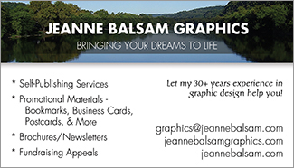
 But let’s go back to that personal meeting and the humble business card. I recently re-designed my business card. The front, as you can see, echoes the exact same look as the header of this site. It includes my basic services, my website, this site/blog, and my e-mail.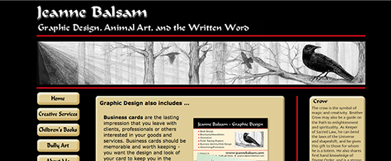
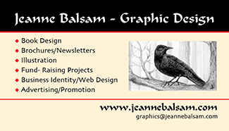 Let’s take a look at my last business card as it relates to my current website. Looking at a screenshot of my site, you can clearly see that the two are related and the same person. Both utilize my own artwork and a crow. (You’ll have to
  They’re light; they’re portable; and easy to save. Business cards really never go out of style, and anyone conducting business of any kind always needs to carry them with them.
 story of you/your business, and contact information. In my own business card, upper left, you see only the front. The back features another illustration of mine and all my contact information.
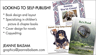
 Another example of a one-sided card is the one I designed for
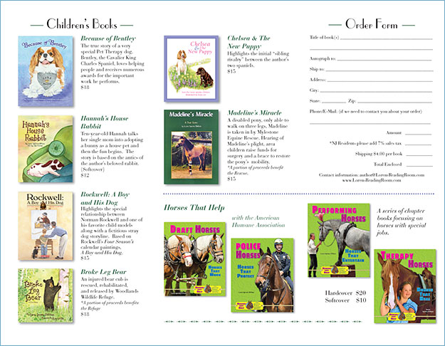
 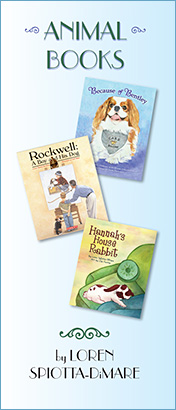 There are plenty of ways to promote yourself as an author, and here’s another one – a brochure. Shown here is a tri-fold brochure which features a selection of animal books that a well-known local author,