The purpose of a redesign is to improve the quality of a project in visuals, text, or both.
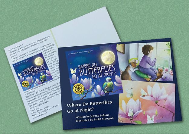
My debut picture book, Where Do Butterflies Go at Night? was released, to my great excitement, in August 2022. Unfortunately, two years later, my small Australian publisher advised me they were going out of business. The result? My beautiful book would disappear off the face of the Earth.
Was there anything I could do?The only option was to purchase the art and rights, and self-publish the book myself. The original book was published hardcover, 8.5″ x 11″. In looking at my possibilities, POD (print-on-demand) offered only one size in common – 8.5″ x 8.5″ – between two different printers if I wanted the option of soft and hard covers.
This required a redesign in format, and some major changes in the artwork itself, but also offered an opportunity for additional creativity.
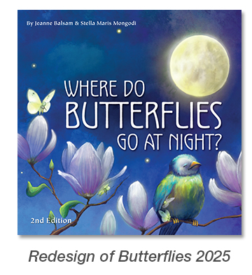
One of the important changes I made in a redesign was to make it more clear what the book is about by rebalancing the title text. In the initial cover, the book’s subject is unclear unless you come up close. I added 2nd Edition to my redesigned book, so it was known that this was not the same publisher, and also enlarged the names of the author (me) and illustrator (Stella Maris Mongodi).
I also set up the interior of the book to more closely resemble a traditional picture book. One of those additions was a half-title page. I also included a dedication page up front, and bios for Stella and me in the back, none of which were included in the original book, but which I felt deserved to be there.
The book also has back matter, providing information about butterflies, their importance as pollinators, and ways a child reader can help them, thereby making a difference in the world. I redesigned this spread to make it lighter and more readable.
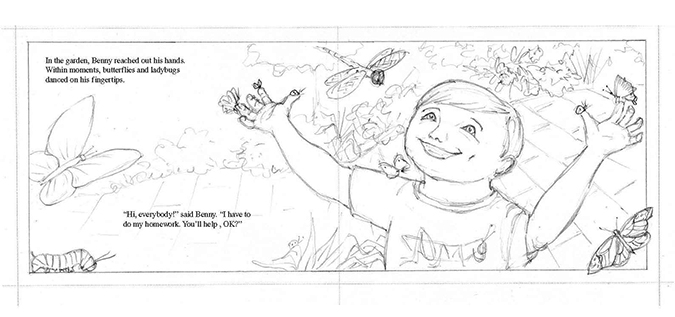
One of the greatest challenges in redesigning “Butterflies” was recreating Stella’s beautiful art into a different size and format., as mentioned above. Here I am deeply grateful for my artistic talent which enabled me to make these changes, and to Stella, who was willing, with her approval along the way, for me to make the changes to her original art.
This sometimes required cropping from the outer edges of the spreads, but often cropping from the inner edges where the outside needed to remain intact, and digital repainting to make it all work. My goal here was to make the final book look like that’s exactly how Stella created it. One of our favorite spreads is below. Hopefully you can’t tell what may be missing from the original spread!
And so ends the tour of what a redesign looks like, the challenges and happy results. If interested in a redesign of one of your projects (need not be a book), please feel free to contact me.
If interested in purchasing Where Do Butterflies Go at Night, 2nd Edition you can find it here on Amazon.