Fundraising is a critical part of any non-profit’s functioning. Without it, all the dedication and inspiration in the world can come to naught if the funds to back your efforts are not there.
One tool in the fundraiser’s toolbox is premiums. They can be included in a donor or cold mailing, or a simple mailing can be designed around them.
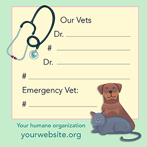
Pictured is a fridge magnet I created for a humane organization I worked for, included in both a donor and cold mailing. While pet parents likely have this information in their phones, others such as pet sitters, firefighters, and neighbors may not. In case of emergency, having this information easily accessible could save a pet’s life.
A magnet is just one possibility for a premium; other possibilities include bookmarks, seed packets, key chains, etc. What are your fundraising needs? As a graphic designer who has fund-raised in the non-profit field for 30+ years, I’d be happy to help you come up with premiums or entire programs to support your wonderful efforts.
We are often in a situation when you want to give the person you’re speaking with something to remember you by. Even in our digital age, print has a place.
Above you see three projects I recently completed for a client. Dr. Silverstein is expanding the promotion of her business and needed a new business card, but first she needed something else … a new logo. The new logo I created is now incorporated nicely into her new business card and other promotional avenues.
My client’s first book is being published this September. I was happy to research just the right images and design a bookmark that lets potential readers/purchasers know all about it.
A bookmark should always be tucked into your book at every possible opportunity, but also given out freely to anyone with whom you discuss your book. It easily becomes your best and simplest advertising promotion. You are, after all, talking to readers! Use a business card when you discuss the nature of your business for something that easily tucks into a pocket.
Good design is how they’ll remember you. If I can help you be remembered, please contact me.
When you’re looking at a few publications, what draws you in? It may be the subject matter, but given the subject matter is the same, where do you look? I’ll tell you – you look at something that is well-designed. You are likely not even aware of it, but that’s what grabs your attention.
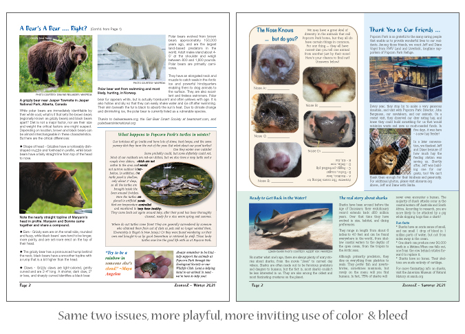
Here’s an example. This is ZoonooZ, the official newsletter of Popcorn Park Animal Refuge. I’ve been its editor and designer for many years, and while I’ve always been evolving its appearance over time, recently I’ve been been able to make some exciting updates. What’s the difference?
Expanded use of color combined with use of the bleed makes for a much more attractive look. There was a time when using a bleed (extending color or graphics right out to the very edge of the page), upped the printing costs considerably, but with most printers nowadays the cost is the same or the difference, nominal. Result? More design freedom and a look that draws you in.
Here’s what the newsletter looked like 10 years ago. Working with a non-profit can mean keeping a close eye on expenses. Even 10 years ago, 4/color printing cost sufficiently more than 2/color that we stayed within an economical look in black and brown. With the wider availability of digital printing, prices for the two became comparable, and we brought the ZoonooZ into full color.
Here’s page 2 of the same two issues. While I was already moving forward with more inviting use of color and design in the winter issue (left), by the time we got to summer? I was having way more fun. And which overall look are you most drawn to? I suspect it’s the issue on right.
I say fun, because design work should be fun. That’s my thought, anyway. And knowing that good design can draw people in, means they’ll look longer and get more involved with the subject matter, in this case a wildlife refuge. And what do we always hope? For a non-profit, we hope that this will translate into donation dollars for the charity. In the case of a business? More sales.
If I can help you/your organization bring you more attention with some wonderful design, feel free to let me know!
Everything in life is always in a state of change; that’s just a given. But it can be a definite good thing when we’re bringing something new and attractive to the table.
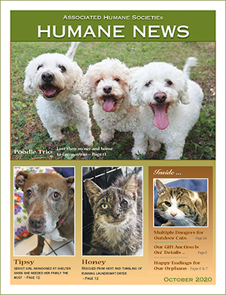
Redesign is often a challenge, but when you’ve already been contemplating doing something new, it’s one of the best. Featured here are two covers of the official publication of the humane organization I work with. The cover with multiple images at left is from October 2020 and followed the format we’ve been using for quite some time, featuring multiple animals and their rescue stories. Even though we’d been doing that for a while, I’m still actually pretty happy with it, but it was time for something new.
I did a few mock-ups for a new design, and the cover below was declared a winner. I agree. Although it features only one animal, the photo is fantastic. There are some outstanding photographers on staff, and it’s not too big a chance to take to assume there will be plenty more great shots to choose from going forward.
I took the short index under the small cat photo in the “Inside” box, and went to a broader listing of the contents in a contrasting type color. There’s a subtle sheer black box behind the white text to help it stand out. And I went full bleed.
The result? Something that really stands out. It has been very well-received with plenty of compliments on the change. In addition, I have continued the redesign in the interior for even more appeal.
Take a quick look here, and you’ll see the evolution of this cover, starting back in 2007. However, I began working with them sometime earlier when that same cover was only two colors – primarily black and white with spot color in one signature.
Improving the look of an organization’s or individual’s communications works, and attracts more donors or customers. Change is good!
People are still reading. A lot. The New York Times still has a best-seller list; sales on Amazon are doing great; children’s books have increased in sales; and NPR has an extensive list featuring their favorite books each year. What does that mean to you? That promoting your endeavors with a bookmark is still a great idea. Think of it as a functional business card.
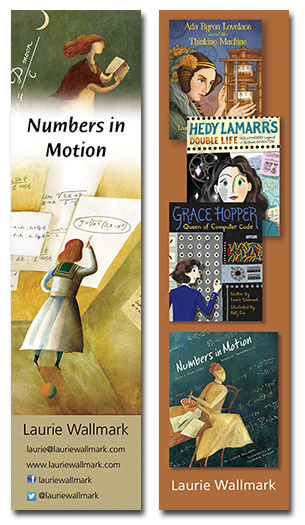
It goes without saying that authors, whether traditionally or self-published, can use this valuable promotional tool and keep themselves in the public’s eye. Laurie Wallmark, author of numerous picture books whose focus is women in STEM, has had the great fortune to have her stories illustrated by some excellent artists. One of her books is Numbers in Motion about the mathematician Sophie Kowalevski, illustrated by Yevgenia Nayberg. I am the lucky person who designs Laurie’s bookmarks, and this one was a real treat because I am just enamored of the art.
I chose vignettes from two of Yevgenia’s illustrations plus Laurie’s web presence for one side, and her published books to date, including the book cover slightly larger, on the reverse. The result is a visually pleasing collection of beautiful illustrations, an invitation to learn about this book, and the others as well. You can do the same at Laurie’s website.
But what if you have something else you want to promote? Maybe your graphic design business.
An example here is the front of my bookmark promoting my own graphics business, which reflects the hero image of my website, and offers my services.
And on the back, listing the services I offer to help authors self-publish their books, promoting my specialty, children’s books.
One of the beauty of bookmarks? They are not terribly expensive and can be produced by any number of reputable online printers.
Another wonderful use for a bookmark is for your organization. In this regard, I’m thinking particularly of non-profits, but if the design is appealing and provides the recipient with the information and inspiration to check out a company’s website and/or social media, then it’s worth it!
Pictured here is a bookmark I designed for the Associated Humane Societies and Popcorn Park Refuge here In NJ. It was part of a larger fundraising appeal I created and I do believe that this lovely bookmark had something to do with the results being much better than the year prior. Who can resist a (shelter) dog putting his paw in your hand? Or one of the refuge tigers napping on a sunny rock?
Here’s the bottom line. Although we live in a very digital world, people are still reading. There are also some programs available for the “lay person” to create their own promotional materials. I have seen some excellent examples from some talented people, and some that are truly cringeworthy. The thing is … you want to be remembered positively. If beautifully done graphic design is not your area of expertise, don’t put out something half-baked.
Get great results with a pro … and here I am! Just contact me – I’m happy to help!
One of the advantages of direct mail is that you can land something absolutely stunning right into someone’s hands, tailored to their interests. That someone can then take their time, look over the piece, and feel the impact.
Direct mail is alive and well, contrary to the assertions of some digitally-oriented naysayers. Its success depends on at least two things – one, know the audience you need to reach to insure a positive response, and two, send an attention-getting package that matches up with the recipients’ interests.
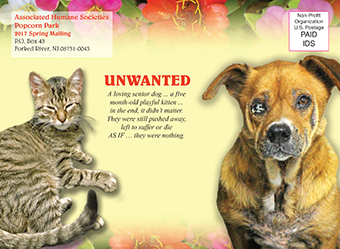
Featured here are the components of a fundraising package I created (wrote and designed from start to finish) for a humane society I worked with for 30+ years. This organization is dedicated to taking in the animals that society has discarded and giving them a bright, loving future. I’d say their donor base falls in between the hard left humane organizations which show you the most brutal images of animal cruelty and the soft right which focuses more on cute puppies and kittens.
The pieces I created for them had to be honest, but not so raw that people wanted to throw the piece away without really looking at it. If you don’t get the recipient to open the envelope, you’ve lost the donation. This particular package was mailed to their regular donor list. With minor adjustments, it could be easily used in a cold mailing.
There are 5 components: a 4-color, 5″x 7″ card with photos and an appeal letter written up inside which tells the story of these two animals, an outer envelope, a BRE, a response document, and a premium. For the second year in a row, we featured a custom-designed flower seed packet, based on positive donor response from the year before. The packet (below) is glue-tipped to the back of the card so it shows through a window on the back of the outer envelope.
The theme of the piece is “UNWANTED”, and tells the story of an abandoned, horribly neglected senior dog, and a 5-month-old kitten, put out on the fire escape in the dead of winter as punishment by her owner. The outer envelope and card front show how the two looked when they arrived at the humane society. The interior of the card (above) details all that the humane society did for these two, including finding them loving homes. The back of the card shows the dog’s happy adoption day photo.The packet of Zinnia seeds encourages the donor to enjoy planting and growing them as they can help the organization grow and help more animals like these. The response document and BRE, continue the theme.
This is just one of an endless variety of possibilities and formats in fundraising campaigns. This piece and format were highly successful; they showed the outstanding work of the organization, and the presentation, written from a heartfelt perspective in a visually attractive package told the animals’ stories well. I also work with great professionals in printing and mailing to make sure your appeal hits home.
Can I bring my talents to your organization and help you make a difference? I’d be happy to, so feel free to contact me with any questions.
p.s. And just to add a little happy ending for you graphics readers, here is a photo of that sweet senior dog, Emily, after the humane society restored her to the best health she had probably known in years.