Everything in life is always in a state of change; that’s just a given. But it can be a definite good thing when we’re bringing something new and attractive to the table.
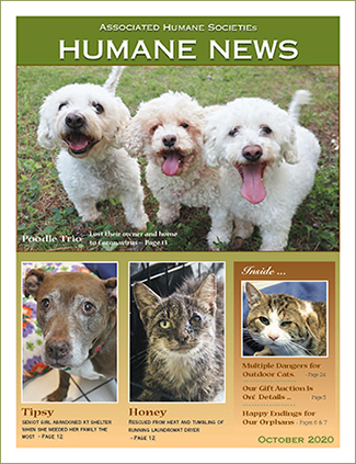
Redesign is often a challenge, but when you’ve already been contemplating doing something new, it’s one of the best. Featured here are two covers of the official publication of the humane organization I work with. The cover with multiple images at left is from October 2020 and followed the format we’ve been using for quite some time, featuring multiple animals and their rescue stories. Even though we’d been doing that for a while, I’m still actually pretty happy with it, but it was time for something new.
I did a few mock-ups for a new design, and the cover below was declared a winner. I agree. Although it features only one animal, the photo is fantastic. There are some outstanding photographers on staff, and it’s not too big a chance to take to assume there will be plenty more great shots to choose from going forward.

I took the short index under the small cat photo in the “Inside” box, and went to a broader listing of the contents in a contrasting type color. There’s a subtle sheer black box behind the white text to help it stand out. And I went full bleed.
The result? Something that really stands out. It has been very well-received with plenty of compliments on the change. In addition, I have continued the redesign in the interior for even more appeal.
Take a quick look here, and you’ll see the evolution of this cover, starting back in 2007. However, I began working with them sometime earlier when that same cover was only two colors – primarily black and white with spot color in one signature.
Improving the look of an organization’s or individual’s communications works, and attracts more donors or customers. Change is good!
How can I help you? Please reach out!
