Promoting Your Children’s Book

There are many ways to promote a book, but some are a little more spectacular than others.

Pictured here is my debut picture book, “Where Do Butterflies Go at Night?” The artwork by illustrator Stella Maris-Mongodi is so rich, and truly magical.

I wanted to capitalize on that and get the book’s image, plus information about it, into the hands of those who would want to sell it – butterfly gardens and conservatories. And what better way than to send it to them?

I created a postcard for a mailing – a perfect 5 x 7″ size that won’t get lost in the incoming mail; have done some research; and have a list of these organizations to send to. The plus with this book is that it also has back matter addressing the importance of butterflies as pollinators. Something a butterfly conservatory may want to share with its patrons by way of education.

Digital promotion is very important, of course, but it’s much easier to ignore and delete an email than it is to toss away a gorgeous piece of art in your hands. A piece of art that may also bring an organization more money.

If I can help you promote your book, please let me know.

Self-Publishing VII – More on Illustration

Let’s take a moment to talk about the importance of illustration – good illustration – when self-publishing your book.

Here is an example of spectacular illustration, and I can proudly say that this – Where Do Butterflies Go at Night? – is my own debut picture book, and yes, it is traditionally published. But …

… this illustrator provides amazing art to both publishers and individuals alike. In fact, she, Stella Mongodi, has illustrated more picture books for self-publishing individuals than anything else.

One of the things I often see in self-published picture books is less-than-spectacular art. Why is that? Many first-time authors are excited about being published and appearing on Amazon, but when it comes to the art, they want to save money. I have come across this numerous times. The result? Not the best looking book!

The question is, do you want to sell your book? If you do, you will need to be prepared to pay a good illustrator and a good designer. You are competing with many, many other titles whose artwork is both eye-catching and professional. And those are the books that sell!

Next, you ideally want an illustrator who has some experience in picture books, or who can render illustrations to the size you require. If you’re doing an 8 x 8″ book, they should understand how a 2-page spread will lay out, how the art will fit in that format, and know what a bleed and a gutter is. As a children’s book designer, I spend a lot of time, which must be charged to the client, fixing and adjusting artwork that could have been done correctly initially. A good illustrator is so important, and It also helps greatly when you work with a good designer from the beginning.

The takeaway here? Do things in the proper order if you’re new to all this – a designer first to help with a dummy, book size, etc., and illustrator next. When the artwork is done, the designer will pull it all together for you. And be willing to invest what it takes to make your book shine and stand out in a crowd!!

Pictured here are the bookmarks I designed for my book. If interested, Butterflies is currently available for pre-order on bookshop.org, Amazon, and Barnes & Noble.

What Grabs Your Attention?

When you’re looking at a few publications, what draws you in? It may be the subject matter, but given the subject matter is the same, where do you look? I’ll tell you – you look at something that is well-designed. You are likely not even aware of it, but that’s what grabs your attention.

Here’s an example. This is ZoonooZ, the official newsletter of Popcorn Park Animal Refuge. I’ve been its editor and designer for many years, and while I’ve always been evolving its appearance over time, recently I’ve been been able to make some exciting updates. What’s the difference?

Expanded use of color combined with use of the bleed makes for a much more attractive look. There was a time when using a bleed (extending color or graphics right out to the very edge of the page), upped the printing costs considerably, but with most printers nowadays the cost is the same or the difference, nominal. Result? More design freedom and a look that draws you in.

Here’s what the newsletter looked like 10 years ago. Working with a non-profit can mean keeping a close eye on expenses. Even 10 years ago, 4/color printing cost sufficiently more than 2/color that we stayed within an economical look in black and brown. With the wider availability of digital printing, prices for the two became comparable, and we brought the ZoonooZ into full color.

Here’s page 2 of the same two issues. While I was already moving forward with more inviting use of color and design in the winter issue (left), by the time we got to summer? I was having way more fun. And which overall look are you most drawn to? I suspect it’s the issue on right.

I say fun, because design work should be fun. That’s my thought, anyway. And knowing that good design can draw people in, means they’ll look longer and get more involved with the subject matter, in this case a wildlife refuge. And what do we always hope? For a non-profit, we hope that this will translate into donation dollars for the charity. In the case of a business? More sales.

If I can help you/your organization bring you more attention with some wonderful design, feel free to let me know!

Getting to Know You

Beyond meeting you in person, how do people get to know you? Nowadays, the internet is going to be the primary way of learning about you, what you do, and what services and/or products you offer if you are in business. Between a website, blog, and social media, people will know plenty. And then, if they want to know more, they’ll pop your name into a search engine and know more than you’d probably ever think (or want) to tell them.


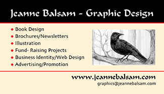
But let’s go back to that personal meeting and the humble business card. I recently re-designed my business card. The front, as you can see, echoes the exact same look as the header of this site. It includes my basic services, my website, this site/blog, and my e-mail.

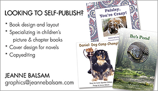
The back of the card provides information about an aspect of my business I am expanding, helping people self-publish in children’s books. I’ve detailed my services, provided a few samples, and repeated my e-mail.

Here’s what’s important about the front of the card looking like my web design – when people come visit, using my card for “directions”, they know they’re arrived at the right destination. Each time they look at my card or come to this site, I am now associated with that gorgeous river shot and that I will bring their dreams to life. (Yes, I will.) It’s called branding, or brand recognition. You recognize it best when you see a company’s logo which appears on all their products, communications, etc. However, I’m not that big of a company to need a logo (in my opinion), so I’ll be happy if you just connect the dots.

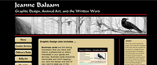
Let’s take a look at my last business card as it relates to my current website. Looking at a screenshot of my site, you can clearly see that the two are related and the same person. Both utilize my own artwork and a crow. (You’ll have to go to my website to read more on that.)

The card details what I do. It also listed my physical address and my phone number (deleted here), neither of which I choose to display nowadays, nor do I need to. Connected as we all are via the internet, my location is irrelevant, and I choose to make all initial contact via e-mail. I liked this card just fine, but I am also no longer offering some of those services;  the back side of the card needs to serve prospective clients better; and I want that all important visual cohesiveness.

So … getting to know you? I’m very happy to meet you, but when I go home, how will I remember who you are? I just met 30 people! Oh, I know – you gave me a business card. And look at that – I’ve arrived at your website and I can learn more.

How can I help you be better known? As you can see, I have a few ideas, so get in touch!


Business Cards

They’re light; they’re portable; and easy to save. Business cards really never go out of style, and anyone conducting business of any kind always needs to carry them with them.

The standard business card is 2″ x 3.25″, a little larger than what you see here in the post. To optimize the space on a business card, you generally want to take advantage and use both sides of the card and include as much information as you need to share.  But in some instances, one side will do. Those who take your cards can make notes on the blank side.

Because the space is limited, you want to think carefully about what wording will be on the card – certainly you need your name and/or business name, a visual that tells the story of you/your business, and contact information. In my own business card, upper left, you see only the front. The back features another illustration of mine and all my contact information.

In the card at right, there is no need for extended information beyond what the front of the card shows. What makes this card unique is that I did a portrait of one of Toni’s dogs and incorporated her favorite flower, the pansy, and then used that as the focus for her business card.

Another example of a one-sided card is the one I designed for Laurie Wallmark for her first published children’s book, Ada Byron Lovelace and the Thinking Machine. It’s simple, to the point, shows the beautiful book cover, and provides Laurie’s contact information.

Bring your business card with you everywhere, ready to hand  out to anyone who wants to know about you and what you do. Include them in mailings, with your product, in other businesses that will promote you, and so on. It’s one of the simplest and most basic ways you can promote yourself.

In addition to knowing what needs to be included on a business card, you also need to know a good designer, and that would be me. Contact me with your business card needs, and check here for additional samples of business cards I’ve designed.

Brochures … for Authors

There are plenty of ways to promote yourself as an author, and here’s another one – a brochure. Shown here is a tri-fold brochure which features a selection of animal books that a well-known local author,  Loren Spiotta-DiMare, has available – some for adults, most for children. On this particular project, Loren had asked for my help in  re-creating the brochure to be similar to her last one. The original designer was unavailable, so I essentially did a new layout, added new books, plus new design elements and fonts. The end product was similar, but clearly new and different.

I’ve worked with Loren in the past in helping her self-publish, as well as with several other projects, so I was happy to bring something fresh to her brochure. The front is simple and tells you what you’ll find inside. In the center panel of the outside of the brochure we have author information and a photo of Loren with some of her children’s books. On the third fold-in panel, are featured four books for adults.

Inside the brochure, above, you’ll see a fairly comprehensive selection of her children’s books, including short summaries and pricing. In the upper right is an order form.

Brochures like this do assume that you have a good selection of books to offer, but a brochure doesn’t always have to have 3 panels, either. It could have 2 panels, or it could just be one – 1/3 of what you see above – known as a rack card. In a case like that, you could feature your book(s) on the front, and on the back, author information and an order form. Simple.
And … any of these can be made into a PDF and shared by e-mail or be made available for download on your website or social media sites.

Where would you use these? Certainly at events, book festivals, and at, and in advance of, school events for kids. You could have them on display, or if you suspected your audience might want to order more than one title, or in multiples, you might send some on ahead of your visit. In fact, send them to anyone you think might be interested in purchasing your book(s)! While I’m not sure of the policies they must follow, librarians might welcome a small catalog such as this as well. Some of the books featured are self-published, but others have been printed by traditional publishers.

If you want to sell more books, you need to be pro-active, especially if you are self-publishing. When you are published traditionally, a huge amount of publicity is done by the publisher on your behalf, far beyond what the average self-publishing author could ever do. That’s why it’s so important to think of how you can promote yourself! If I can help, let me know.

See more samples of my graphic design work.