Is 2023 Your Year to Be Published?

Are those your hands typing away on your manuscript? Are you done yet? If you’re considering self-publishing, this is the time to get in touch with a graphic designer!

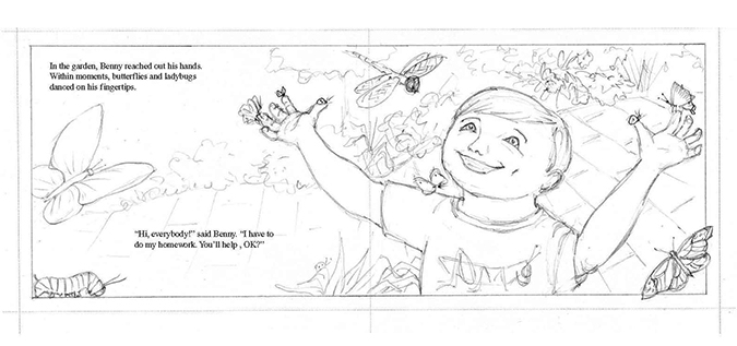
Look into what’s involved before you have art done. Find out how making a dummy can make all the difference in your finished picture book, and save you money!

I specialize in helping children’s book authors bring your story and ideas together, design a beautiful book for you, and get it ready for press.

Are you ready? Start learning what’s involved right here on my website, and contact me with questions and let’s make a beautiful book for you!!

Promoting Your Children’s Book

There are many ways to promote a book, but some are a little more spectacular than others.

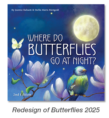
Pictured here is my debut picture book, “Where Do Butterflies Go at Night?” The artwork by illustrator Stella Maris-Mongodi is so rich, and truly magical.

I wanted to capitalize on that and get the book’s image, plus information about it, into the hands of those who would want to sell it – butterfly gardens and conservatories. And what better way than to send it to them?

I created a postcard for a mailing – a perfect 5 x 7″ size that won’t get lost in the incoming mail; have done some research; and have a list of these organizations to send to. The plus with this book is that it also has back matter addressing the importance of butterflies as pollinators. Something a butterfly conservatory may want to share with its patrons by way of education.

Digital promotion is very important, of course, but it’s much easier to ignore and delete an email than it is to toss away a gorgeous piece of art in your hands. A piece of art that may also bring an organization more money.

If I can help you promote your book, please let me know.

Workshop

Can I do a workshop for you?

As a published author and illustrator, graphic designer, and experienced public speaker, I am available to do a presentation on Self-Publishing 101 for Children’s Books.

I would be more than happy to educate your group on all that is entailed in self-publishing a children’s book. Workshop contents include critical points such as:
* Idea/concept
* Story
* Importance of a dummy
* Design
* Illustration
* Traditional Publishing vs. Self-Publishing

Interested? For complete details please contact me and inquire. I’d love to hear from you!

Please note that workshops need to be in reasonable travel distance from my home. Thank you!

Self-Publishing VIII – New Challenges

A recent self-publishing project has been my second with author, MJ Zonfrillo. The Boy Who Found His Talent is a picture book story of a boy who’s bored, but doesn’t know what he wants to do, and his journey to finding what that is. It’s always great working with someone I’ve worked with before; it makes the whole process easier and more fun.

Let’s look at some of the successes and challenges in creating this book. MJ does a great job of doing a dummy, but … it was put together for me after the illustrations were done and that created some missed opportunities.

The illustrator, who is very talented, never did a picture book before. Sandy’s forte is animals, so a complete book with humans presented some challenges, but MJ had taken care of all that before the art was presented to me. One of the things I would have liked to see done differently would have been a much more extensive use of 2-page spreads. In this book, there are only two.

The result was that there are too many pages with an illustration on one side and the opposite side has only a few lines of text, (see above.) This misses the opportunity to use full color throughout, but also gives the child reader far less to look at.

Another issue was not apparent until I received the art and that was that the artwork itself was not painted out far enough to provide for the full bleed for the page size. In some cases, the illustrations could be slightly enlarged, but in others, it meant my having to paint in areas to provide the needed bleed. Also, the scans, which had been made by a print shop, had a somewhat greenish cast to them, and much color-correcting had to be done.

The last challenge was that the illustrator had not been asked to do a separate image just for the cover, so MJ and I were left to figure out which interior images might be used for this purpose. As it turned out, this was pretty do-able and we were able to use one for the front cover, and a different one for the back cover.

All in all, it still went quite smoothly, and having a client who’s great to work with makes it all so much easier (and fun!) The Boy Who Found His Talent looks great with attractive front and back covers, and plenty of interest on the inside portraying a solid story, which also includes photos of the main character in his various theatrical endeavors.

What could have been done differently? As mentioned in earlier posts, there is a great advantage to working with the designer early on, and before giving the assignment to the illustrator. This could have provided many more 2-page spreads and a better use of the 4/color availability for picture books. This way the illustrator understands exactly what’s expected of him/her, especially if they’ve never done a picture book.

My second recommendation is to utilize an illustrator who has experience in picture books and understands all that is required to give me properly sized, finished art so I can just pop it in on the page. I spend more time than should be needed in correcting things, which adds to the final cost, and which would have been avoided if an illustrator experienced in picture books was hired.

So that’s it. Another great collaboration and another beautiful book finished!! Ready to start your self-published book? (Or other graphic design project?) Reach out; I’m happy to help!

Is This Your Year to Be Published?

It’s a New Year, and it’s time to think about where you’re headed. So many people have a dream of being published, of actually having a book in their hands that has their name on the cover as the author, and maybe the illustrator, as well. You may have that dream, too, but perhaps feel compelled to keep it a little quiet. After all, isn’t that a bit of a luxury to go and have yourself published? Maybe not.

Do you have something important, something relevant, or just plain fun, you’d like to share with children? Some part of your life experience that might make a difference to someone? Something you know or feel or dream about that could bring knowledge, a smile, or enlightenment to another. I believe we all have something to bring the world, and perhaps a book is the avenue for you to express it.

If you think you would like to be a self-published author, I’d be happy to help you achieve that dream. Above are just a few of the books I’ve had the privilege of bringing to life; each one has a post about it here on this site where you can read more. You can also find out more of what self-publishing is about on any of the tabs up top.

Is 2022 going to be your year to be published? Let me know!

Make A Bookmark Fun

Bookmarks are hardly my biggest projects … but they are often the most fun. Why? Because they’re little pieces of art that serve a great purpose … helping someone keep their place in their book and promoting you!

And when you are creating them for a really colorful and entertaining book, there’s no way the result can’t be engaging, too. Pictured here is the bookmark I just created for Laurie Wallmark‘s new picture book, Dino Pajama Party. Having access to all the images in the book allowed me to cut and silhouette a variety of dinosaurs and include Laurie’s favorites, too.

A bright and friendlybookmark helps make reading even more fun for little ones, too. How can I help you? Let me know!

What Grabs Your Attention?

When you’re looking at a few publications, what draws you in? It may be the subject matter, but given the subject matter is the same, where do you look? I’ll tell you – you look at something that is well-designed. You are likely not even aware of it, but that’s what grabs your attention.

Here’s an example. This is ZoonooZ, the official newsletter of Popcorn Park Animal Refuge. I’ve been its editor and designer for many years, and while I’ve always been evolving its appearance over time, recently I’ve been been able to make some exciting updates. What’s the difference?

Expanded use of color combined with use of the bleed makes for a much more attractive look. There was a time when using a bleed (extending color or graphics right out to the very edge of the page), upped the printing costs considerably, but with most printers nowadays the cost is the same or the difference, nominal. Result? More design freedom and a look that draws you in.

Here’s what the newsletter looked like 10 years ago. Working with a non-profit can mean keeping a close eye on expenses. Even 10 years ago, 4/color printing cost sufficiently more than 2/color that we stayed within an economical look in black and brown. With the wider availability of digital printing, prices for the two became comparable, and we brought the ZoonooZ into full color.

Here’s page 2 of the same two issues. While I was already moving forward with more inviting use of color and design in the winter issue (left), by the time we got to summer? I was having way more fun. And which overall look are you most drawn to? I suspect it’s the issue on right.

I say fun, because design work should be fun. That’s my thought, anyway. And knowing that good design can draw people in, means they’ll look longer and get more involved with the subject matter, in this case a wildlife refuge. And what do we always hope? For a non-profit, we hope that this will translate into donation dollars for the charity. In the case of a business? More sales.

If I can help you/your organization bring you more attention with some wonderful design, feel free to let me know!

Change Is Good – Especially in Design

Everything in life is always in a state of change; that’s just a given. But it can be a definite good thing when we’re bringing something new and attractive to the table.

Redesign is often a challenge, but when you’ve already been contemplating doing something new, it’s one of the best. Featured here are two covers of the official publication of the humane organization I work with. The cover with multiple images at left is from October 2020 and followed the format we’ve been using for quite some time, featuring multiple animals and their rescue stories. Even though we’d been doing that for a while, I’m still actually pretty happy with it, but it was time for something new.

I did a few mock-ups for a new design, and the cover below was declared a winner. I agree. Although it features only one animal, the photo is fantastic. There are some outstanding photographers on staff, and it’s not too big a chance to take to assume there will be plenty more great shots to choose from going forward.

I took the short index under the small cat photo in the “Inside” box, and went to a broader listing of the contents in a contrasting type color. There’s a subtle sheer black box behind the white text to help it stand out. And I went full bleed.

The result? Something that really stands out. It has been very well-received with plenty of compliments on the change. In addition, I have continued the redesign in the interior for even more appeal.

Take a quick look here, and you’ll see the evolution of this cover, starting back in 2007. However, I began working with them sometime earlier when that same cover was only two colors – primarily black and white with spot color in one signature.

Improving the look of an organization’s or individual’s communications works, and attracts more donors or customers. Change is good!

How can I help you? Please reach out!

Self-Publishing V – Picture Books

One of the best parts of any design project is the opportunity to create something new, unique, and appealing for your client and their audience. But it can be an exciting challenge to stay within certain parameters, such as size limitations, when you are provided with  a variety of elements created without those parameters in mind.

Such was the case in designing the picture book “The Little Girl Who Lost Her Words” for author MJ Zonfrillo. This was MJ’s first foray into the world of self-publishing. While she had devoted a great deal of time to her manuscript and hired an excellent artist in Sue Griggs-Bailey, the combination of a beginner’s level of experience and a portrait artist  who had never worked in children’s books presented a few challenges.

Let me first say that I am so appreciative of those people I work with, like MJ, who are so willing to learn and want to do everything they can to make the project go smoothly. Thank you to you all.
MJ had a dummy assembled in a looseleaf binder and came ready to work. The illustrations were provided on a flash drive in a suitably-sized jpg. format. However, because the dummy was created after the illustrations were completed – the reverse of the usual order of things – I had to sometimes work a bit in reverse. Also, the illustrator, being an accomplished portrait artist, provided a number of similar-appearing images in portrait style that would need to be presented in different ways so as to provide the variety needed in a 32-page picture book.

Above right is a beautiful image Sue had drawn of the main character, Ava, looking wistfully up at some butterflies. But this needed to be a 2-page spread — what was the best way to go about this? I could have used the image on one side of the spread and used the opposing side for text, but there was another option to make it more interesting. See below, the final spread, using Photoshop, and incorporating Sue’s own background to extend the image.

MJ had chosen an 8.5 x 11″ format.  Some of the images supplied worked wonderfully as single page images, and there were others that worked well as spreads. Very few were provided with an awareness of where the gutter would be and how it would affect the look of the spread. Others needed a variety of cropping, others needed to be made to work in page-and-a-half size, and in some cases, Photoshopping to make them work in the chosen format. This is where my being an artist, not just a designer, comes in handy!

Pictured above is the original art for a two-page spread. It would have been perfect for a horizontal format, but our final size for a 2 page spread is 17″ wide by 11″ high – quite a difference. What I needed to do was first trim the drawing down to clean edges all around, then see what I could afford to lose from the left and right sides. Next, I had to piece the two together overlapping, then eliminate a swath down the middle to fit the above dimensions, and paint the two together in Photoshop to create a continuous image so the finished piece looked like it had always been that way. Voila!

One of the things MJ learned from this experience is the proper order of: finalized MS, dummy, then illustrations. With such beautiful artwork and MJ’s trust in my design ability to modify Sue’s art respectfully when needed, I was able to bring it all together to make a beautiful finished book that all of us are really proud of. With such a lovely first book, I look forward to working with MJ again on whatever her next project might be.

Self-Publishing IV – Chapter Books

When I was approached by a children’s writer to do a chapter book, my first inclination was to say `no’. Really, I much preferred to stick with picture books because that’s what I think I’m best at and what I enjoy most. But wait … I’ve never designed a chapter book before, how would I know? And that was the start of working on The Last Rhino with  Deb Stevenson.

A chapter book is different than a picture book in many ways. The interior is in black and white with color on the cover only; it appeals to an older child; it is significantly longer and broken into short chapters; and sets up differently as it most resembles a small novel.

One of the things I have loved about working with the authors I have is that they care. In this case, Deb cares about the fact that the rhino is slowly becoming extinct, and is donating a portion of the book’s proceeds towards rhino conservation.  (Read more about The Last Rhino.) My job was to create a book that didn’t depend on bright, colorful illustrations, but invited children to read this touching story and to appreciate the wonderful art of the illustrator, Morgan Spicer, in black and white. Morgan’s drawings were sometimes full page, and sometimes partial, sharing the page with text.

The Last Rhino was more of a collaborative effort than other projects I’ve worked on where I was the only one with a background in publishing. This was sometimes a challenge, but ultimately a good experience in working in a different environment.

Likewise, I was challenged to learn new skills in preparing files for press by the online printers, particularly Ingram Spark, whom Deb chose for some of the copies of the book.  This publisher had requirements that I’d never met before in all my years in file prep and printing, and so I searched, learned, and conquered!

The placement of Morgan’s full and partial page illustrations was largely determined by the text, but utilizing her art here and there as spots throughout the book  and on the back cover (the front all but designed itself), was a really enjoyable part of doing the layout. Designing chapter divisions and setting up the backmatter section was also a pleasure.

As it turns out, my concerns about what might be difficult in designing a chapter book  were completely unfounded. Like any new project, it required me to think a bit differently than I had on other books I’d done in the past and, in the end, I have the knowledge of what designing and setting up a chapter book entails. We are all thrilled with The Last Rhino in every way, and it is now another skill that I can confidently offer prospective clients.

Have a chapter book you’d like to bring to life?  Contact me and let me know because I can now promise you a stunning chapter book!