People are still reading. A lot. The New York Times still has a best-seller list; sales on Amazon are doing great; children’s books have increased in sales; and NPR has TV programs about their favorite books each year. What does that mean to you? That promoting your endeavors with a bookmark is still a great idea. Think of it as a functional business card.
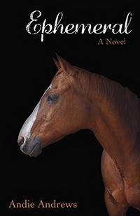
 It goes without saying that authors, whether traditionally or self-published, can use this valuable promotional tool and keep themselves in the public’s eye. Laurie Wallmark, author of numerous picture books whose focus is women in STEM, has had the great fortune to have her stories illustrated by some excellent artists. Her most recently published book is Numbers in Motion about the mathematician Sophie Kowalevski, illustrated by Yevgenia Nayberg. I am the lucky person who designs Laurie’s bookmarks, and this one was a real treat because I am just enamored of the art.
I chose vignettes from two of Yevgenia’s illustrations plus Laurie’s web presence for one side, and all of her published books to date, including the book cover slightly larger, on the reverse. The result is a visually pleasing collection of beautiful illustrations, an invitation to learn about this book, and the others as well. You can do the same at Laurie’s website.
But what if you’re not an author? Is there something you do that you want to promote?

 An example here is my own shop on Etsy which focuses on a growing collection of cards and other items for the French Bulldog. Any books? Not a one. But does every sold item I send out have a promotional bookmark tucked in? You bet!
And I’m hoping that buyers from my Etsy Frenchie art shop may use and enjoy that bookmark and come back and visit, even if just to check and see what’s new in cute Frenchie stuff.
One of the beauty of bookmarks? They are not terribly expensive and can be produced by any number of reputable online printers.
Another wonderful use for a bookmark is for your organization. In this regard, I’m thinking particularly of non-profits, but if the design is appealing and provides the recipient with the information and inspiration to check out a company’s website and/or social media, then it’s worth it!
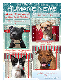
 Pictured here is a bookmark I designed for the Associated Humane Societies and Popcorn Park Refuge here In NJ. It was part of a larger fundraising appeal I created and I do believe that this lovely bookmark had something to do with the results being much better than the year prior. Who can resist a (shelter) dog putting his paw in your hand? Or one of the refuge tigers napping on a sunny rock?

Here’s the bottom line. Although we live in a very digital world, people are still reading. There are also some programs available for the “lay person” to create their own promotional materials. I have seen some excellent examples from some talented people, and some that are truly cringeworthy. The thing is … you want to be remembered positively. If beautifully done graphic design is not your area of expertise, don’t put out something half-baked.
Get great results with a pro … and here I am! Just contact me – I’m happy to help!
 One of the best parts of any design project is the opportunity to create something new, unique, and appealing for your client and their audience. But it can be an exciting challenge to stay within certain parameters, such as size limitations, when you are provided with a variety of elements created without those parameters in mind.
 illustrations were provided on a flash drive in a suitably-sized jpg. format. However, because the dummy was created after the illustrations were completed – the reverse of the usual order of things – I had to sometimes work a bit in reverse. Also, the illustrator, being an accomplished portrait artist, provided a number of similar-appearing images in portrait style that would need to be presented in different ways so as to provide the variety needed in a 32-page picture book.


 One of the things I have loved about working with the authors I have is that they care. In this case, Deb cares about the fact that the rhino is slowly becoming extinct, and is donating a portion of the book’s proceeds towards rhino conservation. (
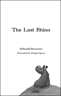 Likewise, I was challenged to learn new skills in preparing files for press by the online printers, particularly Ingram Spark, whom Deb chose for some of the copies of the book. This publisher had requirements that I’d never met before in all my years in file prep and printing, and so I searched, learned, and conquered!
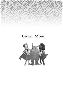 As it turns out, my concerns about what might be difficult in designing a chapter book were completely unfounded. Like any new project, it required me to think a bit differently than I had on other books I’d done in the past and, in the end, I have the knowledge of what designing and setting up a chapter book entails. We are all thrilled with
  As designers, we wear many hats … layout expert, font wrangler, photo magician. But one most people don’t think of is detective. And to be a good graphic designer, you have to be one. Maybe even a super-sleuth.


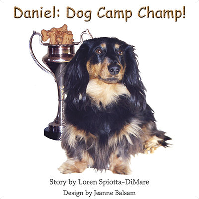
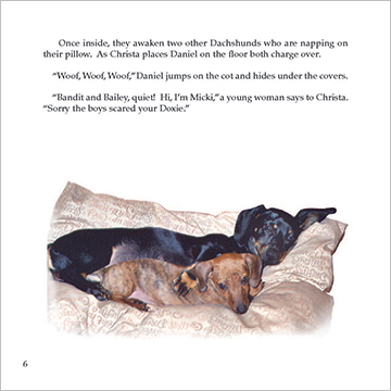 So what can one do about that? Why not be creative with the photographic images? Pictured here is Daniel, Dog Camp Champ! by
  which were not originally related. So on page 9 we have our energetic Welsh Springer Spaniel having a great time romping on the shore of the lake at the doggie agility camp. Was he ever there? Not at all. but with some handy silhouetting, combining, and juxtapositioning … he is now!
 showing that Daniel is not just looking on but may also long to be a part of the fun. It also removes background that may have nothing to do with the scene being written about. Again, I’ve used the soft edges as I have through much of the book.

 to that person, and, as an option, you can enclose a premium that they will want to keep or use. And you can give them the opportunity of sitting with your piece on the sofa, at their desk, or dining room table, away from the incessant demands of their computer or phones, if they so wish.
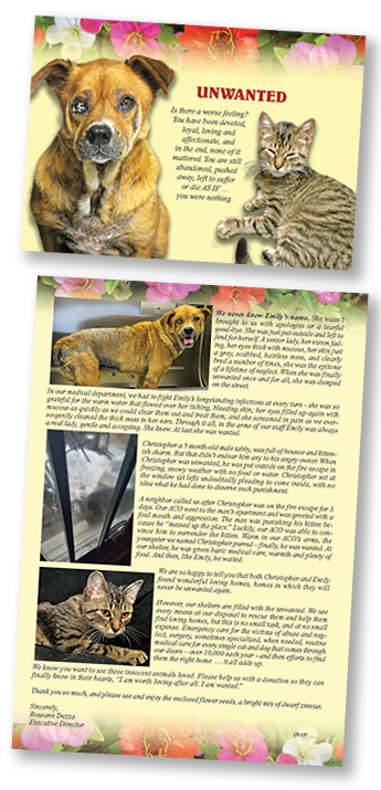 Featured in this post are the components of a fundraising package I created (wrote and designed from start to finish) for the
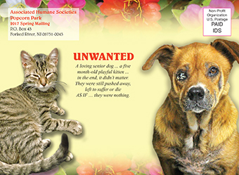
  The theme of the piece is “UNWANTED”, and tells the story of a senior dog, left horribly neglected and sick, then abandoned on the street, and a 5 month-old kitten, put out on the fire escape in the dead of winter as punishment by an angry owner. The outer envelope and card front show Emily (the dog) and Christopher (the kitten) as they looked when they arrived at the humane society. The interior of the card (above) details what the humane society did for these two, how they took care of all their medical needs, and best of all, found them loving homes. The back of the card shows the dog’s happy adoption day photo. In addition, the recipient received a packet of Thumbelina Zinnia seeds, encouraging the donor to enjoy planting and growing them as they can help the organization grow and help more animals like these. The response document and BRE, continue the theme of these two animals and images of the zinnias.
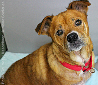 work with a wonderful printing outfit,
  It’s a new year and a new opportunity to reach your audience, be they fans, donors, colleagues, or others who have an interest in you. A newsletter can be a great way to let “your people” know what’s going on with you and/or your business. Depending on your needs, a newsletter can be sent snail mail, digitally, posted on your website and social media for download, or all of the above to meet your recipients and followers’ preferences.
 One of the things that I do for the ZoonooZ (and could do for you) is use my excellent writing skills to write the entire publication from start to finish. After I write it, the ZoonooZ then goes to Popcorn Park’s director for proofing and any corrections in content. Or I can design a beautiful newsletter for you; you can send me all the content; and I can do the layout and prep for e or standard mailing. Or I can re-design that tired newsletter you already have that needs a facelift!
 social media, people will know plenty. And then, if they want to know more, they’ll pop your name into a search engine and know more than you’d probably ever think (or want) to tell them.
 But let’s go back to that personal meeting and the humble business card. I recently re-designed my business card. The front, as you can see, echoes the exact same look as the header of this site. It includes my basic services, my website, this site/blog, and my e-mail.
 Let’s take a look at my last business card as it relates to my current website. Looking at a screenshot of my site, you can clearly see that the two are related and the same person. Both utilize my own artwork and a crow. (You’ll have to