To be realistic, self-publishing a children’s book is a lot of work. Depending upon what talents you bring to the table yourself, it also involves a lot of coordination of other people – an editor, if needed, an illustrator, and a graphic designer, at the least.

But getting the book finished and to press is only one part of the work. You still have to market your book! This is something you want to do for a traditionally published book as well, in addition to the publisher promoting you.
Some of the promotion needs to be ahead of the book’s release, and some after, but the bottom line is if you want your book to sell, be prepared to market it.

There’s plenty of in-depth information online about how to market, so here, I’m, going to offer you a few ideas that you might want to look into.
- Reviews – if you want reviews, send your book in whatever format is required to reviewers in advance of the release. For some, like Kirkus, you will need to pay for a review. But you can also research bloggers who specialize in the genre, age-group and/or subject matter of your book and request online reviews.
- Bookmarks – have these designed, printed, and ready to use in any of your promotions/mailings and to share with people you meet.You’ll also want to tuck a bookmark into each book you sell.
- Press releases – these can be sent to local or national publications, aligned with your book’s subject matter, if appropriate. Be prepared to send PDFs by email or hard copies, whatever they require.
- Events – look for events coming up where you and your book will be a good fit – book fairs, author events, or aligned fields of interest.
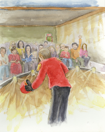
- School visits – research and approach the schools in your area and further afield where you’re willing to travel to see if you might do school visits, and prepare to do presentations.
- Book launch/book signings – ask your local bookstore or other similar venue if they would host you and a book signing.
- Special mailings – reach out to organizations aligned with your subject matter and who might be willing to carry your book.

Keep in mind that, while self-published books have gained in both popularity and recognition, they are still not always accepted as the equivalent of a traditionally published book. Marketing is essential to sell books, so be prepared to learn and take the steps necessary to see your books in children’s hands!
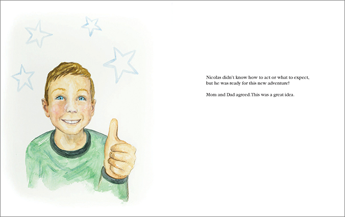
Above, you see numerous ways I have been promoting my own picture book, Where Do Butterflies Go at Night?. I’ve sent a postcard mailing to butterfly gardens, a letter to local schools, am attending a crafts fair (again) with my book, making school visits, and very importantly, I designed my bookmarks which I give out every chance I get!
How can I help you? Please contact me, and let me know!
p.s. Where Do Butterflies Go at Night? is available at select book stores and everywhere books are sold online.