When I was approached by a children’s writer to do a chapter book, my first inclination was to say `no’. Really, I much preferred to stick with picture books because that’s what I think I’m best at and what I enjoy most. But wait … I’ve never designed a chapter book before, how would I know? And that was the start of working on The Last Rhino with Deb Stevenson.

A chapter book is different than a picture book in many ways. The interior is in black and white with color on the cover only; it appeals to an older child; it is significantly longer and broken into short chapters; and sets up differently as it most resembles a small novel.
 One of the things I have loved about working with the authors I have is that they care. In this case, Deb cares about the fact that the rhino is slowly becoming extinct, and is donating a portion of the book’s proceeds towards rhino conservation. (Read more about The Last Rhino.) My job was to create a book that didn’t depend on bright, colorful illustrations, but invited children to read this touching story and to appreciate the wonderful art of the illustrator, Morgan Spicer, in black and white. Morgan’s drawings were sometimes full page, and sometimes partial, sharing the page with text.
The Last Rhino was more of a collaborative effort than other projects I’ve worked on where I was the only one with a background in publishing. This was sometimes a challenge, but ultimately a good experience in working in a different environment.
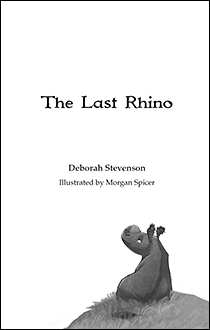 Likewise, I was challenged to learn new skills in preparing files for press by the online printers, particularly Ingram Spark, whom Deb chose for some of the copies of the book. This publisher had requirements that I’d never met before in all my years in file prep and printing, and so I searched, learned, and conquered!
The placement of Morgan’s full and partial page illustrations was largely determined by the text, but utilizing her art here and there as spots throughout the book and on the back cover (the front all but designed itself), was a really enjoyable part of doing the layout. Designing chapter divisions and setting up the backmatter section was also a pleasure.
 As it turns out, my concerns about what might be difficult in designing a chapter book were completely unfounded. Like any new project, it required me to think a bit differently than I had on other books I’d done in the past and, in the end, I have the knowledge of what designing and setting up a chapter book entails. We are all thrilled with The Last Rhino in every way, and it is now another skill that I can confidently offer prospective clients.
Have a chapter book you’d like to bring to life? Contact me and let me know because I can now promise you a stunning chapter book!
 As designers, we wear many hats … layout expert, font wrangler, photo magician. But one most people don’t think of is detective. And to be a good graphic designer, you have to be one. Maybe even a super-sleuth.


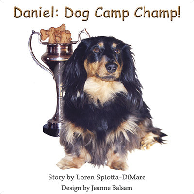
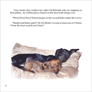 So what can one do about that? Why not be creative with the photographic images? Pictured here is Daniel, Dog Camp Champ! by
  which were not originally related. So on page 9 we have our energetic Welsh Springer Spaniel having a great time romping on the shore of the lake at the doggie agility camp. Was he ever there? Not at all. but with some handy silhouetting, combining, and juxtapositioning … he is now!
 showing that Daniel is not just looking on but may also long to be a part of the fun. It also removes background that may have nothing to do with the scene being written about. Again, I’ve used the soft edges as I have through much of the book.
 to that person, and, as an option, you can enclose a premium that they will want to keep or use. And you can give them the opportunity of sitting with your piece on the sofa, at their desk, or dining room table, away from the incessant demands of their computer or phones, if they so wish.
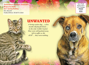
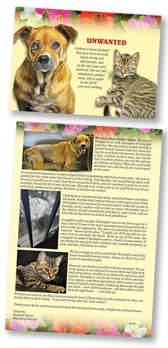 Featured in this post are the components of a fundraising package I created (wrote and designed from start to finish) for the
  The theme of the piece is “UNWANTED”, and tells the story of a senior dog, left horribly neglected and sick, then abandoned on the street, and a 5 month-old kitten, put out on the fire escape in the dead of winter as punishment by an angry owner. The outer envelope and card front show Emily (the dog) and Christopher (the kitten) as they looked when they arrived at the humane society. The interior of the card (above) details what the humane society did for these two, how they took care of all their medical needs, and best of all, found them loving homes. The back of the card shows the dog’s happy adoption day photo. In addition, the recipient received a packet of Thumbelina Zinnia seeds, encouraging the donor to enjoy planting and growing them as they can help the organization grow and help more animals like these. The response document and BRE, continue the theme of these two animals and images of the zinnias.
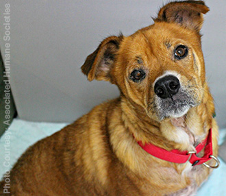 work with a wonderful printing outfit,
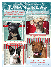
  It’s a new year and a new opportunity to reach your audience, be they fans, donors, colleagues, or others who have an interest in you. A newsletter can be a great way to let “your people” know what’s going on with you and/or your business. Depending on your needs, a newsletter can be sent snail mail, digitally, posted on your website and social media for download, or all of the above to meet your recipients and followers’ preferences.
 One of the things that I do for the ZoonooZ (and could do for you) is use my excellent writing skills to write the entire publication from start to finish. After I write it, the ZoonooZ then goes to Popcorn Park’s director for proofing and any corrections in content. Or I can design a beautiful newsletter for you; you can send me all the content; and I can do the layout and prep for e or standard mailing. Or I can re-design that tired newsletter you already have that needs a facelift!
 social media, people will know plenty. And then, if they want to know more, they’ll pop your name into a search engine and know more than you’d probably ever think (or want) to tell them.
 But let’s go back to that personal meeting and the humble business card. I recently re-designed my business card. The front, as you can see, echoes the exact same look as the header of this site. It includes my basic services, my website, this site/blog, and my e-mail.
 Let’s take a look at my last business card as it relates to my current website. Looking at a screenshot of my site, you can clearly see that the two are related and the same person. Both utilize my own artwork and a crow. (You’ll have to
 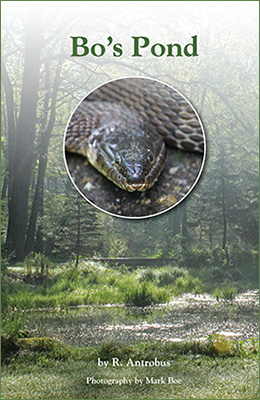 As discussed in an
 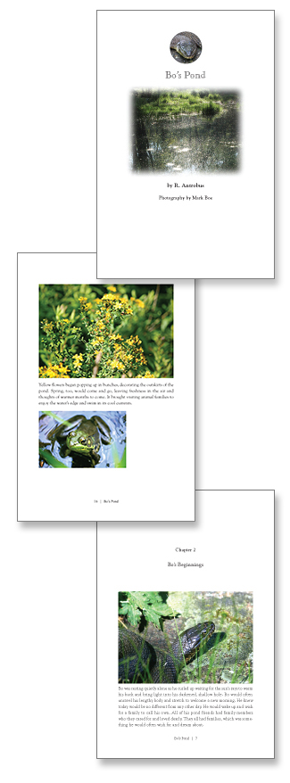 Not long ago, a writer friend and I came across a self-published book written by someone we know. I don’t know who did the cover, but it did a huge disservice to the writer, so much so that neither of us were really excited about knowing what the book was about. It was actually off-putting. And that’s where good graphic design comes in. Your cover – and the graphic design of your book – can make or break you. Want someone to open your book? Make it look good.
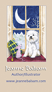 They’re light; they’re portable; and easy to save. Business cards really never go out of style, and anyone conducting business of any kind always needs to carry them with them.
 story of you/your business, and contact information. In my own business card, upper left, you see only the front. The back features another illustration of mine and all my contact information.
 Another example of a one-sided card is the one I designed for
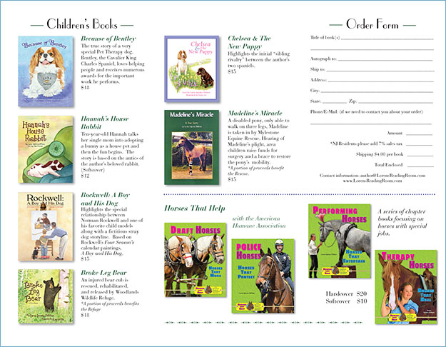
 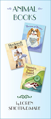 There are plenty of ways to promote yourself as an author, and here’s another one – a brochure. Shown here is a tri-fold brochure which features a selection of animal books that a well-known local author,