Fundraising – Premiums

Fundraising is a critical part of any non-profit’s functioning. Without it, all the dedication and inspiration in the world can come to naught if the funds to back your efforts are not there.

One tool in the fundraiser’s toolbox is premiums. They can be included in a donor or cold mailing, or a simple mailing can be designed around them.

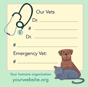
Pictured is a fridge magnet I created for a humane organization I worked for, included in both a donor and cold mailing. While pet parents likely have this information in their phones, others such as pet sitters, firefighters, and neighbors may not. In case of emergency, having this information easily accessible could save a pet’s life.

A magnet is just one possibility for a premium; other possibilities include bookmarks, seed packets, key chains, etc. What are your fundraising needs? As a graphic designer who has fund-raised in the non-profit field for 30+ years, I’d be happy to help you come up with premiums or entire programs to support your wonderful efforts.

Questions? Please contact me.

Change Is Good – Especially in Design

Everything in life is always in a state of change; that’s just a given. But it can be a definite good thing when we’re bringing something new and attractive to the table.

Redesign is often a challenge, but when you’ve already been contemplating doing something new, it’s one of the best. Featured here are two covers of the official publication of the humane organization I work with. The cover with multiple images at left is from October 2020 and followed the format we’ve been using for quite some time, featuring multiple animals and their rescue stories. Even though we’d been doing that for a while, I’m still actually pretty happy with it, but it was time for something new.

I did a few mock-ups for a new design, and the cover below was declared a winner. I agree. Although it features only one animal, the photo is fantastic. There are some outstanding photographers on staff, and it’s not too big a chance to take to assume there will be plenty more great shots to choose from going forward.

I took the short index under the small cat photo in the “Inside” box, and went to a broader listing of the contents in a contrasting type color. There’s a subtle sheer black box behind the white text to help it stand out. And I went full bleed.

The result? Something that really stands out. It has been very well-received with plenty of compliments on the change. In addition, I have continued the redesign in the interior for even more appeal.

Take a quick look here, and you’ll see the evolution of this cover, starting back in 2007. However, I began working with them sometime earlier when that same cover was only two colors – primarily black and white with spot color in one signature.

Improving the look of an organization’s or individual’s communications works, and attracts more donors or customers. Change is good!

How can I help you? Please reach out!