One of the major differences between self-publishing and being published by a mainstream publisher can be in the imagery. When you sign on with a publishing house, you, as an author, will be paid for your story and unless you are an author/illustrator, they will make the arrangements and hire someone to provide the artwork. When it comes to self-publishing, you’re pretty much on your own to provide the images.
If you, as an author, wish to pay an illustrator you will find that it’s not an inexpensive proposition. Creating art takes time – and talent, of course – and may be beyond the financial wherewithal of the average author. For this reason, particularly in picture books where images are critical to not just the look and feel of the book, but also the understanding of the story, there is a preponderance of photography used in the self-publishing world.
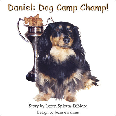
 So what can one do about that? Why not be creative with the photographic images? Pictured here is Daniel, Dog Camp Champ! by Loren Spiotta-DiMare, a picture book for an older picture book reader. Loren wanted more than straightforward images cropped to accommodate the square format, so I had some fun with them and used a variety of techniques in Photoshop. Most of them were quite simple, but made all the difference in the variety of images from one page to the next.
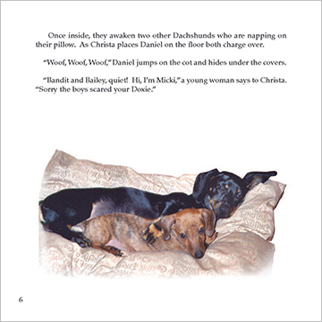
In the image above, I used two simple techniques – I silhouetted the two dogs on the top, dropping out the background of the photo, and softened the edges. I placed the image low on the page, giving the feel of the dogs sleeping on pillows on the floor.
Another technique I used here and there throughout the book was to combine photos  which were not originally related. So on page 9 we have our energetic Welsh Springer Spaniel having a great time romping on the shore of the lake at the doggie agility camp. Was he ever there? Not at all. but with some handy silhouetting, combining, and juxtapositioning … he is now!
Silhouetting can also be a very powerful tool in evoking a feeling from an image. Daniel, our little Dachshund hero, is fearful of participating in the agility challenges. Each time he tries one of the obstacles, he becomes afraid. He is more comfortable watching from the sidelines. I think silhouetting this particular photo is a strong way of 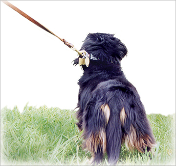 showing that Daniel is not just looking on but may also long to be a part of the fun. It also removes background that may have nothing to do with the scene being written about. Again, I’ve used the soft edges as I have through much of the book.
This was a fun project to do. I had the opportunity of playing in Photoshop and designing a book that relied on photography have more of the look and feel of illustration.
The cover, at top, was also fun. Daniel, the trophy cup, and the biscuits were all separate photos combined for an image that tells a story by itself, but even the title font added some playfulness.

One could go and purchase a wood-y font that looks like summer camp, but why, when you can create something similar in Photoshop? Photoshop is any artists’s dream tool and with minimum effort, the letters can look like carved wood. This isn’t any major magic, just playing around with some of the program’s variables to get a result.
For those who are self-publishing a picture book but do not have the availability of an illustrator, consider the photos you plan on using – might they lend themselves to some creative effects to make your story more attractive and readable? If you think so and are looking for overall lovely book design, please contact me and we’ll talk!
p.s. Should you wish to talk design in person, I will be a guest speaker and panelist at the Animal Writers’ Workshop to be held on April 28th in Oldwick, NJ. There’s still time to register and tickets are still available. Read about the Workshop here.
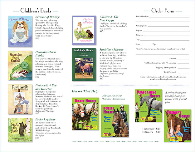
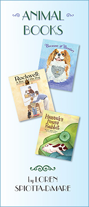 There are plenty of ways to promote yourself as an author, and here’s another one – a brochure. Shown here is a tri-fold brochure which features a selection of animal books that a well-known local author,