
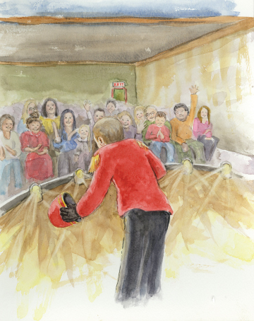
A recent self-publishing project has been my second with author, MJ Zonfrillo. The Boy Who Found His Talent is a picture book story of a boy who’s bored, but doesn’t know what he wants to do, and his journey to finding what that is. It’s always great working with someone I’ve worked with before; it makes the whole process easier and more fun.
Let’s look at some of the successes and challenges in creating this book. MJ does a great job of doing a dummy, but … it was put together for me after the illustrations were done and that created some missed opportunities.
The illustrator, who is very talented, never did a picture book before. Sandy’s forte is animals, so a complete book with humans presented some challenges, but MJ had taken care of all that before the art was presented to me. One of the things I would have liked to see done differently would have been a much more extensive use of 2-page spreads. In this book, there are only two.
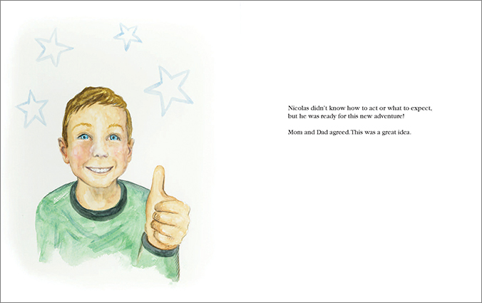
The result was that there are too many pages with an illustration on one side and the opposite side has only a few lines of text, (see above.) This misses the opportunity to use full color throughout, but also gives the child reader far less to look at.

Another issue was not apparent until I received the art and that was that the artwork itself was not painted out far enough to provide for the full bleed for the page size. In some cases, the illustrations could be slightly enlarged, but in others, it meant my having to paint in areas to provide the needed bleed. Also, the scans, which had been made by a print shop, had a somewhat greenish cast to them, and much color-correcting had to be done.
The last challenge was that the illustrator had not been asked to do a separate image just for the cover, so MJ and I were left to figure out which interior images might be used for this purpose. As it turned out, this was pretty do-able and we were able to use one for the front cover, and a different one for the back cover.
All in all, it still went quite smoothly, and having a client who’s great to work with makes it all so much easier (and fun!) The Boy Who Found His Talent looks great with attractive front and back covers, and plenty of interest on the inside portraying a solid story, which also includes photos of the main character in his various theatrical endeavors.
What could have been done differently? As mentioned in earlier posts, there is a great advantage to working with the designer early on, and before giving the assignment to the illustrator. This could have provided many more 2-page spreads and a better use of the 4/color availability for picture books. This way the illustrator understands exactly what’s expected of him/her, especially if they’ve never done a picture book.
My second recommendation is to utilize an illustrator who has experience in picture books and understands all that is required to give me properly sized, finished art so I can just pop it in on the page. I spend more time than should be needed in correcting things, which adds to the final cost, and which would have been avoided if an illustrator experienced in picture books was hired.
So that’s it. Another great collaboration and another beautiful book finished!! Ready to start your self-published book? (Or other graphic design project?) Reach out; I’m happy to help!


 Every story being self-published has a story of its own for the designer. What made it fun and appealing? What presented challenges? How were they resolved and could they have been avoided?


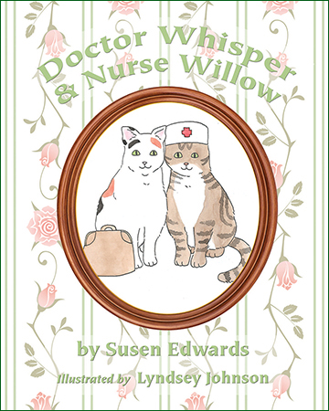
 As for the scanning? Nothing. This was just an unfortunate turn of events that no one could have predicted. The image of the cats getting lost in the gutter? That could be remedied by working with a designer who is familiar with children’s books (such as myself!) where a dummy could be put together before illustrating began, thus assuring proper placement of all pictorial elements. The key here is a dummy (and the subject for another post.)
 One of the best parts of any design project is the opportunity to create something new, unique, and appealing for your client and their audience. But it can be an exciting challenge to stay within certain parameters, such as size limitations, when you are provided with a variety of elements created without those parameters in mind.
 illustrations were provided on a flash drive in a suitably-sized jpg. format. However, because the dummy was created after the illustrations were completed – the reverse of the usual order of things – I had to sometimes work a bit in reverse. Also, the illustrator, being an accomplished portrait artist, provided a number of similar-appearing images in portrait style that would need to be presented in different ways so as to provide the variety needed in a 32-page picture book.
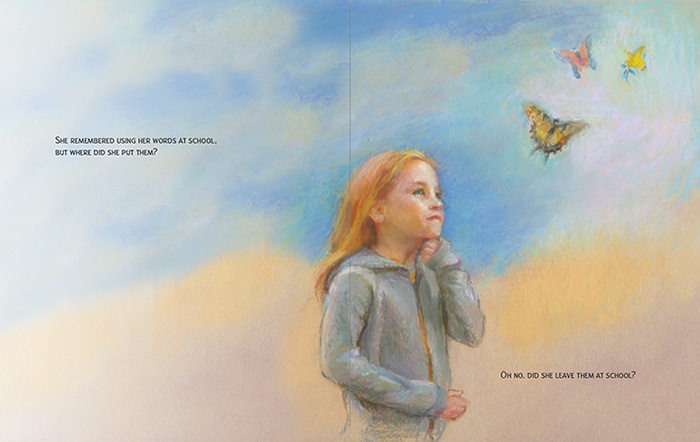


 One of the things I have loved about working with the authors I have is that they care. In this case, Deb cares about the fact that the rhino is slowly becoming extinct, and is donating a portion of the book’s proceeds towards rhino conservation. (
 Likewise, I was challenged to learn new skills in preparing files for press by the online printers, particularly Ingram Spark, whom Deb chose for some of the copies of the book. This publisher had requirements that I’d never met before in all my years in file prep and printing, and so I searched, learned, and conquered!
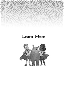 As it turns out, my concerns about what might be difficult in designing a chapter book were completely unfounded. Like any new project, it required me to think a bit differently than I had on other books I’d done in the past and, in the end, I have the knowledge of what designing and setting up a chapter book entails. We are all thrilled with
 So what can one do about that? Why not be creative with the photographic images? Pictured here is Daniel, Dog Camp Champ! by
  which were not originally related. So on page 9 we have our energetic Welsh Springer Spaniel having a great time romping on the shore of the lake at the doggie agility camp. Was he ever there? Not at all. but with some handy silhouetting, combining, and juxtapositioning … he is now!
 showing that Daniel is not just looking on but may also long to be a part of the fun. It also removes background that may have nothing to do with the scene being written about. Again, I’ve used the soft edges as I have through much of the book.
 As discussed in an
  Not long ago, a writer friend and I came across a self-published book written by someone we know. I don’t know who did the cover, but it did a huge disservice to the writer, so much so that neither of us were really excited about knowing what the book was about. It was actually off-putting. And that’s where good graphic design comes in. Your cover – and the graphic design of your book – can make or break you. Want someone to open your book? Make it look good.